EMS
A mobile emergency experience designed to save lives, letting users share critical info in seconds.
Skip to the solution →
A mobile emergency experience designed to save lives, letting users share critical info in seconds.
Skip to the solution →Redesigned the 911 experience for real-world emergencies where speaking is impossible or
time is running out.
In moments of panic, violence, or medical distress, speaking is often impossible, yet the 911 system still expects callers to verbally explain:
• Where they are
• What’s happening
• What medical conditions they have
More than 10,000 lives are lost annually in the U.S. due to delayed or inaccurate location data during emergency calls. This outdated, voice-first process costs time. And time costs lives.
Reimagine the emergency call experience for faster and safer rescue
.png)
The traditional process is outdated:
01. Caller tries to describe location (often inaccurately)
02. Dispatcher collects details manually
03. Help is sent, sometimes too late
We needed to design for worst-case scenarios, not ideal ones. The experience had to work when the user was unable to speak, think clearly, or navigate complex menus.
Lead UX Designer & Researcher
What we heard from real 911 callers:
I tried to talk but I froze.
There were no signs or landmarks.
I had no idea where I was.
They kept asking about allergies, I couldn’t remember.
Hypothesis
We believed panic, location ambiguity, and lack of access to medical data were the key blockers in emergency response.
From surveys and secondary research from KGW article, we confirmed three core user pain points:
We focused on people in high-stress emergencies where communication breaks down:
.png)
We mapped lightweight, testable flows for emergency activation, onboarding, and medical access before moving on to more detailed designs.

We ran usability tests using clickable Figma prototypes. Participants were asked to complete panic-simulation tasks, such as triggering SOS without speaking or locating allergy info under time pressure. This surfaced UI clarity issues we quickly addressed.

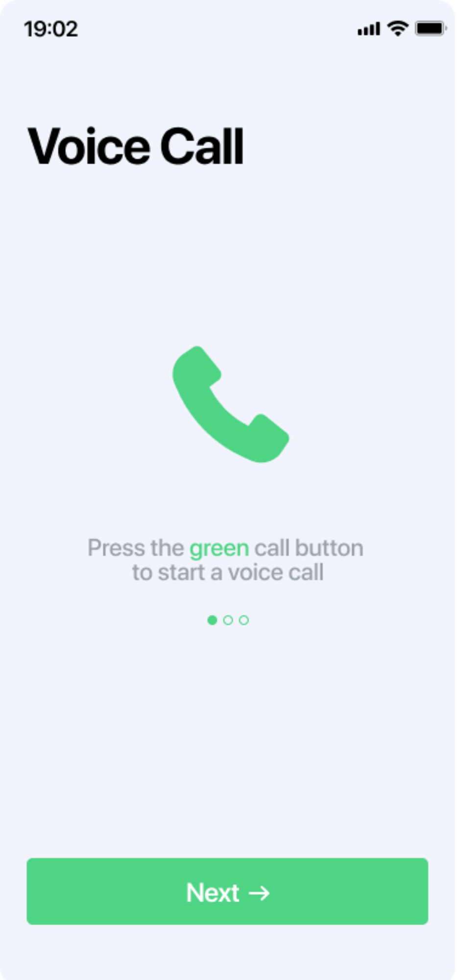
We optimized for touch, visibility, and silent operation - so users could focus on survival, not navigation.
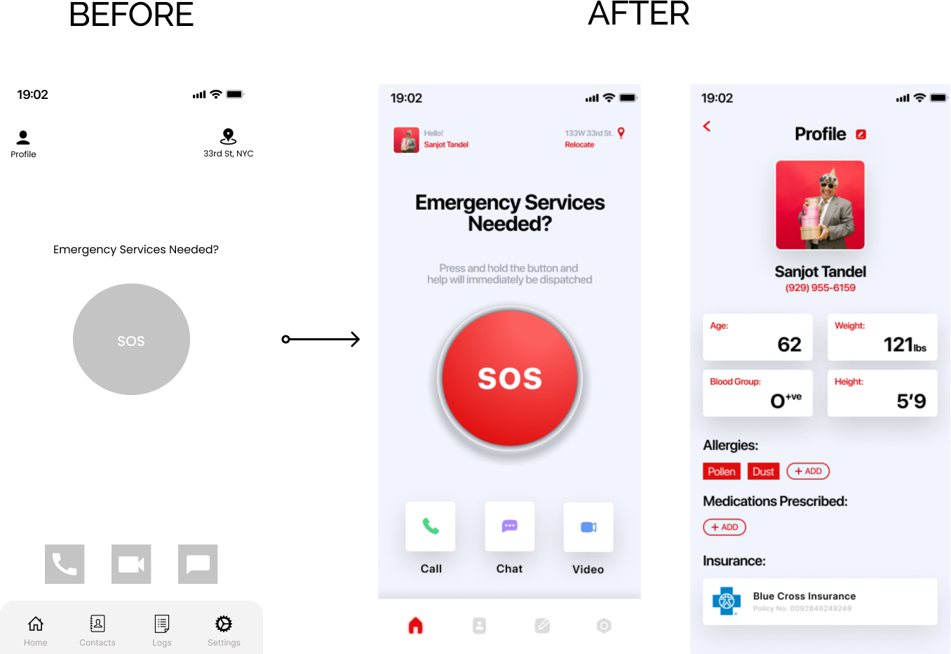
Before the redesign
The process relied entirely on voice-based communication, offering no silent option and no automated medical info or live location sharing.

After the redesign
Users could silently request help in seconds. Key medical info was accessible at a glance. Real-time GPS shared their location instantly, with zero need for verbal communication. It wasn’t just better design; it was a system built for survival.
Accessibility Considerations
We used large tap targets, simplified layouts, and high-contrast buttons to accommodate users under stress and those with limited motor control or visual clarity.
%20(14%20%C3%97%2020%20in)%20(1960%20%C3%97%201080%20px)%20(8).png)


%20(14%20%C3%97%2020%20in)%20(20%20%C3%97%2020%20in)%20(30%20%C3%97%2020%20in)%20(3).png)
 (2)-poster-00001.jpg)
This project reshaped how I think about UX. Designing for distress taught me that great UX isn’t always made for ideal moments. In just 4 weeks, we delivered an experience people felt they could rely on.